My Music Video

My Website

My Website
Click on the image to view my website

Monday, December 3, 2018

Blog Post 12: My Location Reccie, Risk Assessment and Location Permissions

Location reccie, risk assessment and location permissions were all important as it helped me scout a suitable location for my shoot and find out how this location can be turned into a fitting set. Risk assessment was a necessary safety procedure so I could be aware of any possibles problems I may encounter during my shoot. I chose to shoot at my house and mostly in my living room.

(A messy) Location Reccie for my first advert

(A slightly more hidden messiness)Location Reccie for my second advert


Location signature from my parents as I was shooting at their house.
(Can ignore the permission for Raymond)
Location risk assessment when filming at my house
(Can ignore when filming at Wal. Central.)


The reccies were helpful as they helped me think about lighting and mise-en-scene for the shots. There were a couple problems with the mise-en-scene such as constantly shifting tables and many other things into other rooms while we were filming, but these were dealt with and thankfully did not affect the shoot too much. We were warned about the dangers of the shoot with the risk assessment so we did not confront any problems during the shoot.

Blog Post 11: My Practice Shoot/Edit

The practice shoot was done so I could get a rough idea about how my advert would feel and what the imitations could be when filming. I did this by filming and editing a practice shoot of the adverts on my phone.


Despite the many limitations of filming and editing on a phone, the shoot helped me understand the importance of my voice-over and how the things shown on the screen should be more engaging. This, in turn, encouraged me to re-think about what could be shown on screen as I needed to engage the audience as much as possible.

Blog Post 10: My Advert Storyboards

Once my timelines were completed I created these storyboards to help me visualise my advert with more ease. I used a large sheet of paper, post-it notes and my (questionable) drawing skills to create it. Each shot had its own post-it note, and these were not drawn well but good enough so that the basics of the shot could be shown. The post-it notes helped me move shots around to see what helped the story flow best.

The storyboard for my first advert

Storyboard for the second advert


These storyboards were a great visual aid to help me understand how the viewer would see the advert. This enabled me to ask what changes I could make to my advert as other classmates could understand generally what would be shown. Many changes were made to my advert during the storyboarding phase, most notably in the first advert. The start of the advert was very boring as nothing much would be happening on screen, the main character would just be walking around the room looking very anxious. This shot was replaced by the main character finishing her preparations for the party. This was a bit more engaging as it allowed for more varied shot types which helped explain the story better.

Blog Post 9: My Advert Timelines

After establishing my initial ideas, I made timelines to help organise my thoughts into a full advert. This also gave me space to figure out more minute details such as timings and framing. I got a sheet of A3 paper and drew three lines across them. One represented what would be shown on the video, another displayed the sound of the video, consisting of voice over and sound effects. The middle line was in case I had any extra ideas or thoughts that I wanted to note down.

The timeline for the first advert


The timeline for the second advert


After I first drafted my adverts, I was happy with them as I only had a couple aspects of the adverts which I was confused about. The timeline was extremely helpful for me as it gave me a clear vision of what I needed to think about and start preparing for the shoot. It also helped me gain some constructive feedback from classmates as my ending was at first not very clear.

Blog Post 8: The Initial Proposal

My initial proposal was crucial so I could get some critical feedback from my classmates. I did this by writing up notes into a notebook and pitching my idea during a lesson.


My first couple ideas

                                       Idea #1


I took my ideas down in note form so I could pitch my basic idea as soon as possible. I then expanded on this after I got my feedback from my peers.

My adverts were based on the idea that the characters had everything ready for an eventful night, they had this and that ready, but they had forgotten the food.

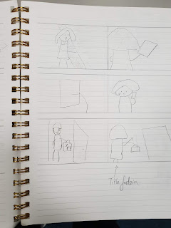
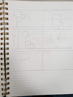
These next 2 pictures show a rough storyboard of what I had in mind as I could visualize my advert quite well.


Idea #2


My second advert is about some people getting ready for a game night but had ultimately forgotten the food.

My Initial storyboards:


The critical feedback I received helped me think about the smaller details about my advert that I had not considered such as where I should film the adverts and how I could exaggerate most of the actors' movements in order to help convey the intended message with ease.

Blog Post 7: Research into Existing TV Commercials in Other Forms (E.g Online, Print, Billboard)

In order to fully understand a brands marketing campaign, I researched into other forms of advertising such as adverts seen on magazines, billboards or online. I did this by searching various terms on google as well as finding adverts on the underground train lines.

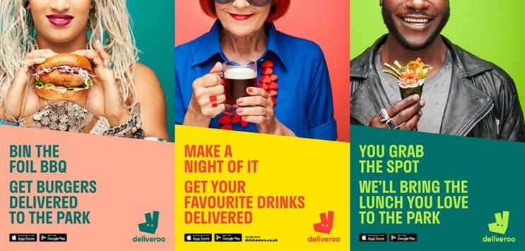
Image result for deliveroo ad


One of my favourite food delivery adverts are from deliveroo as their minimalistic yet eye-catching print adverts are hard to miss around London. By cutting the person's top part of their face helps the viewer focus on the grin each person which brings a positive atmosphere to the advert. There are many vibrant and complimenting colours in the advert which match the brand identity as well as bring a more modern and youthful colour scheme.


Image result for best print adverts

Audi produced a series of adverts promote their newest but slightly cheaper range of cars. The break down of the car is intriguing for most people and makes them want to look more closely at the advert. There are several other faster cars inside the outside car, this was done connote the power of the new car. The distinguishing features from each car inside the cars make a great puzzle for car enthusiasts, and this helps the advert target its niche-r audience of car lovers.


Another notable print advert is the Nescafe advert which shows an alarm clock looking like a cup of coffee. This is a relatable sentiment for many people as when they wake up in the morning, they drink a cup of coffee. The focal image is large and surrounded by a gradient background so the focus is all on the focal image. The richer tones of red have subtle connotations of luxury which gives the brand a more prime feel.

I like these adverts as they are straight to the point and with a clear message that can be seen easily. This more colourful and sometimes minimalistic type of advert is more popular in print adverts nowadays as people only skim over the adverts, so the message must be clearly given in the time the viewer sees it. I will be applying this idea to my advert as I want the audience to clearly understand the story and its resolution.


Blog Post 6: Research into Existing TV Commercials (Other Genres)

I did this so I could find out how other food companies connote their brand. This was done by searching through videos on Youtube and compiling a playlist of them, this can be accessed via my Blog Post 5

Here are the two adverts I learnt most from:

M&S; Adventures in Fiesta


  • The way they show the food is said to be called 'Food Porn'
  • The advert is extravagant and exciting as there is
    • Lots of eye-catching action
    • Many bright colours against a black background to help them stand out
  • This helps glorify the food and bring about positive connotations towards the brand and the food they produce
  • The advert is cut/edited to the beat of the music. This makes the advert very satisfying to watch and in turn quite memorable

McDonald's; Dead Dad Advert


  • The advert tells the story of a boy discovering what his dad was like
  • Lots of emotive appeal
  • Sets up story with a cute kid going through a collection of memorabilia
  • Collection of items fit for an older person, so they aren’t his
  • Final reveal to all questions: what was dad like?
  • Sombre atmosphere created through darker colour grading and slow paced editing
  • Desaturated colour scheme and the constant sad look on the kid’s face also emphasise this
  • Very English family; shown through location, accent, actors, clothing
  • Script is showing how all of the dad’s attributes are juxtaposing all of the kids attributes, and makes the audience feel bad for him
  • He lights up when he thinks of something to ask about his dad, then is disappointed that he doesn’t get the answer he wants
  • Lots of long and empty shots to connote his loneliness
  • A couple close ups to emphasise his sad emotions
  • Most shots have a lot of space and area around the child
  • Mother kinda ignores the kid’s look on his face
  • “1:09 Mother walks off shot for just long enough to capture the feelings of isolation and abandonment before...
  • 1:10 ...*THE LOGO REVEAL!* Smiles, happiness, eye contact between the mother and the son, finally 
  • Note the logo was distinctly absent from the exterior shots just gone 
  • Colour grading seems to get subtly warmer too.  Outside McDonald’s = cold, sad, lonely.  Inside McDonald’s = warm, happy, social.”
  • 1:16 Oh wow, who knew a Filet-o-Fish® could be so poetic?  The moment he opened the packaging the connection to his father he so desperately longed to find was revealed.”
  • Very cute and adorable way to finish if belief was suspended
  • Positive connections to the product
  • If belief not suspended then it’s very funny to see
  • The Logo has it’s own 5 seconds at the end for anchorage
  • Super clear and minimalistic design
  • Minimal text
  • Colour scheme associated with the brand
  • How they style the burger
  • Food shows everything that it has
  • Very perfectionist and idealistic
  • Made to look extremely appetising
  • Shiny, puffed up and is starting to make me hungry

This was very much useful to my final advert as it only confirmed what we previously thought the conventions of TV ads were by watching a wider range of adverts. This also meant I was able to look at a larger variety of ideas to incorporate into my own advert and I used many of these typical ad conventions such as title cards and voice over in my own advert as seen in these other adverts.