Dear Moderator,
welcome to my blog :)
To find my research and planning evidence, please click on the AS Research and Planning label which is on the top right-hand side of my blog.
I hope you like it!
Thank You
Simon Silver (3218)
This blog is now closed.
My Website

Click on the image to view my website
Friday, December 14, 2018
Monday, December 3, 2018
Blog Post 19: My Finished Adverts
I am very pleased with how my adverts turned out; I think my adverts have a fun, engaging and yet relatable story that is slightly exaggerated to make it a bit comedic, all while successfully selling the brand in a positive atmosphere. The modern-styled title card shown at the end of the advert is a typical convention of food delivery adverts and helps secure the brand identity in the audience's mind.
Making these adverts in three weeks from concept to finished product was a challenging yet fun experience as it has taught me a lot about the real media industry and how to manage my time when clients have tight deadlines. I am proud that my hard work has paid off and I'm excited to see what the next project will turn out like!
Making these adverts in three weeks from concept to finished product was a challenging yet fun experience as it has taught me a lot about the real media industry and how to manage my time when clients have tight deadlines. I am proud that my hard work has paid off and I'm excited to see what the next project will turn out like!
Blog Post 18: My Target Audience Feedback
I did an audience feedback session in order to find out what the target audience of my adverts actually thinks about them. To do this, I asked several friends to watch my adverts and then answer a couple of questions. I did this with 4 people, 2 boys (Gideon and Lucas) and 2 girls (Cathy and Scarlet) after a school day.
This is what I found out:
First Impressions:

This is what I found out:
First Impressions:
- Everyone enjoyed the adverts and was hooked until the end. Many people loved the connecting sentiment between the adverts ("I've got this ready, that ready, but wait?!")
- Many people complimented the graphics and said they looked professional
Would they buy from YourFood?
- 3/4 people said that if they saw the adverts after school, they would consider buying some food as they would be extremely hungry and this seemed like a convenient option
- The last person (Cathy) said that she would download the app so she could use the service whenever
Any Improvements?
- Many people noted that the shots are not coloured as professionally as many other adverts
- The mise-en-scene could be improved
- The delivery sequences is not very professional compared to the rest of the adverts

From these responses, I have learnt that I could still improve my adverts but on the whole is very well made and effective. If I had more time I would fix my set and learn to colour correct my shots in a more professional manner. I would also reshoot the delivery sequence as it was not very professional.
Blog Post 17: My Adverts Review
I created a review copy of my adverts so that I could see them on the big screen. These were uploaded onto Youtube:
These allowed me to take a step back from my work and try and find small inconsistencies with my advert on the big screen with the help from classmates and teachers. The things I noticed were that
These allowed me to take a step back from my work and try and find small inconsistencies with my advert on the big screen with the help from classmates and teachers. The things I noticed were that
- The phone screens were a bit too blue
- The street shots are a bit pink
- Some shots were slightly oversaturated
- There are some unintended audio cuts in my first advert
I resolved most of the colour correction issues by adjusting each shot's 3-way colour corrector to colour correct the highlights, mid-tones and shadows of each shot.
Blog Post 16: My Rough Cut
When shooting, we had two weekends in order to finish the real production. The rough cut was vital as it helped me figure out what shots did not work and how I could improve the advert on the whole. This was especially important for me as I felt my practice shoot weekend did not go according to plan as I was not able to get a lot of useful feedback from it I needed to decide on what I needed to re-shoot.
This shoot helped me identify many errors with my adverts such as continuity errors; the fact the adverts were a bit too long and some specific shots I had bad lighting and/or acting for. I also got some critical feedback including how I could incorporate camera movement into my advert and how I could make my advert more faster paced and to the point. I would not have noticed these mistakes or made these improvements if I did not produce these adverts and now the quality of my advert could be much higher.
This shoot helped me identify many errors with my adverts such as continuity errors; the fact the adverts were a bit too long and some specific shots I had bad lighting and/or acting for. I also got some critical feedback including how I could incorporate camera movement into my advert and how I could make my advert more faster paced and to the point. I would not have noticed these mistakes or made these improvements if I did not produce these adverts and now the quality of my advert could be much higher.
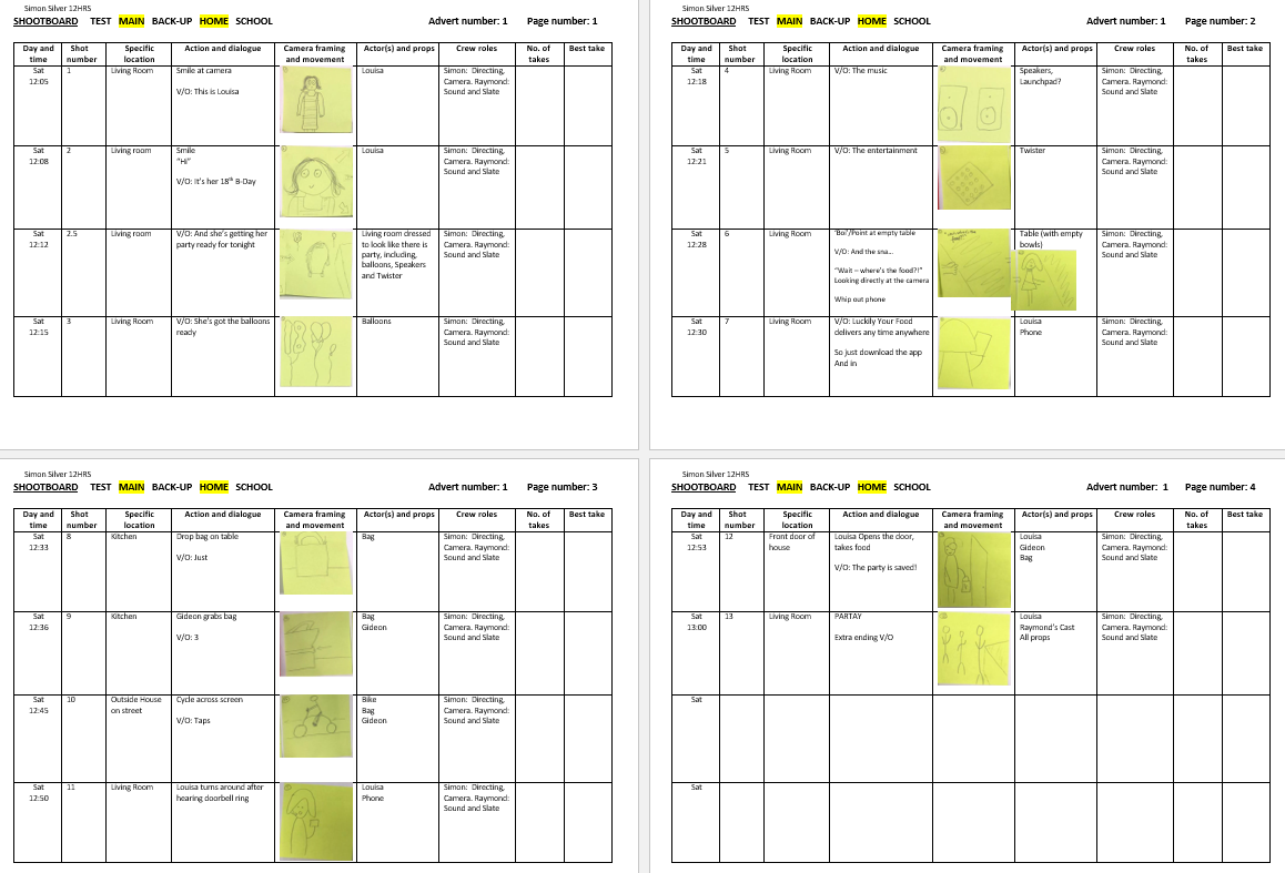
Blog Post 15: My Shootboard
If I did not create a shootboard, my shoot day would have been incredibly hectic and disorganised. The shootboard allowed me to efficiently shoot my advert without wasting any unnecessary time by creating a plan of the day and choosing which shots to shoot and when. I created these on Word using a table and unified format so that it was easy to read. We printed these out and kept them with our camera equipment, ready for the shoot day.
  |
| A sample from the First shoot weekend |
Our shoot days for both weekends had to be incredibly organised as a classmate and I were shooting all of both adverts on the same day so to keep things under control we organised as much as we could before the shoot. The shootboard helped an incredible amount during post-production as well because we marked down which take was the best for each shot. This, in turn, lead to a faster editing process as naming all the footage can be very time-consuming.
Blog Post 14: My Kit list
This was made to ensure that the camera and all it's accompanying equipment could be kept safe and noted of so that I never forgot ant equipment for a shoot.
This was beneficial as it helped me keep the equipment organised and ready for when I had the shoot. We were guided as to how to use the kit and how to keep the footage organised by putting it onto 2 separate SD cards so we could easily transfer them on to our drives when we started to edit.
 |
| The list of equipment that we needed in order to do the shoot |
 |
| A proof that I knew how to operate the equipment and what my responsibilities of the equipment were. |
This was beneficial as it helped me keep the equipment organised and ready for when I had the shoot. We were guided as to how to use the kit and how to keep the footage organised by putting it onto 2 separate SD cards so we could easily transfer them on to our drives when we started to edit.
Blog Post 13: My Time-plan, Crew and Cast-List
I made this cast list so I could confirm and verify the actors coming to the shoot.
The time plan was useful in conjunction with our shootboard as it made sure that we did not run out of time during the day to finish our shoots.
Crew list:
Simon - Directing
Raymond - Camera and Sound
These lists helped me keep everything organised for the shoot days so that I could keep my focus on filming the adverts on the day rather than thinking about who should be doing what. The crew list also helped me make sure I had a range of ethnicities for my shoot.
The time plan was useful in conjunction with our shootboard as it made sure that we did not run out of time during the day to finish our shoots.
 |
| Timeplan for both me and Raymond (a classmate) as he was doing his shoot at my house too. |
Crew list:
Simon - Directing
Raymond - Camera and Sound
These lists helped me keep everything organised for the shoot days so that I could keep my focus on filming the adverts on the day rather than thinking about who should be doing what. The crew list also helped me make sure I had a range of ethnicities for my shoot.
Blog Post 12: My Location Reccie, Risk Assessment and Location Permissions
Location reccie, risk assessment and location permissions were all important as it helped me scout a suitable location for my shoot and find out how this location can be turned into a fitting set. Risk assessment was a necessary safety procedure so I could be aware of any possibles problems I may encounter during my shoot. I chose to shoot at my house and mostly in my living room.

The reccies were helpful as they helped me think about lighting and mise-en-scene for the shots. There were a couple problems with the mise-en-scene such as constantly shifting tables and many other things into other rooms while we were filming, but these were dealt with and thankfully did not affect the shoot too much. We were warned about the dangers of the shoot with the risk assessment so we did not confront any problems during the shoot.
 |
| (A messy) Location Reccie for my first advert |
 | |
|

Location signature from my parents as I was shooting at their house.
(Can ignore the permission for Raymond)
Location risk assessment when filming at my house
(Can ignore when filming at Wal. Central.)
The reccies were helpful as they helped me think about lighting and mise-en-scene for the shots. There were a couple problems with the mise-en-scene such as constantly shifting tables and many other things into other rooms while we were filming, but these were dealt with and thankfully did not affect the shoot too much. We were warned about the dangers of the shoot with the risk assessment so we did not confront any problems during the shoot.
Blog Post 11: My Practice Shoot/Edit
The practice shoot was done so I could get a rough idea about how my advert would feel and what the imitations could be when filming. I did this by filming and editing a practice shoot of the adverts on my phone.
Despite the many limitations of filming and editing on a phone, the shoot helped me understand the importance of my voice-over and how the things shown on the screen should be more engaging. This, in turn, encouraged me to re-think about what could be shown on screen as I needed to engage the audience as much as possible.
Despite the many limitations of filming and editing on a phone, the shoot helped me understand the importance of my voice-over and how the things shown on the screen should be more engaging. This, in turn, encouraged me to re-think about what could be shown on screen as I needed to engage the audience as much as possible.
Blog Post 10: My Advert Storyboards
Once my timelines were completed I created these storyboards to help me visualise my advert with more ease. I used a large sheet of paper, post-it notes and my (questionable) drawing skills to create it. Each shot had its own post-it note, and these were not drawn well but good enough so that the basics of the shot could be shown. The post-it notes helped me move shots around to see what helped the story flow best.
These storyboards were a great visual aid to help me understand how the viewer would see the advert. This enabled me to ask what changes I could make to my advert as other classmates could understand generally what would be shown. Many changes were made to my advert during the storyboarding phase, most notably in the first advert. The start of the advert was very boring as nothing much would be happening on screen, the main character would just be walking around the room looking very anxious. This shot was replaced by the main character finishing her preparations for the party. This was a bit more engaging as it allowed for more varied shot types which helped explain the story better.
 |
| The storyboard for my first advert |
 |
| Storyboard for the second advert |
These storyboards were a great visual aid to help me understand how the viewer would see the advert. This enabled me to ask what changes I could make to my advert as other classmates could understand generally what would be shown. Many changes were made to my advert during the storyboarding phase, most notably in the first advert. The start of the advert was very boring as nothing much would be happening on screen, the main character would just be walking around the room looking very anxious. This shot was replaced by the main character finishing her preparations for the party. This was a bit more engaging as it allowed for more varied shot types which helped explain the story better.
Blog Post 9: My Advert Timelines
After establishing my initial ideas, I made timelines to help organise my thoughts into a full advert. This also gave me space to figure out more minute details such as timings and framing. I got a sheet of A3 paper and drew three lines across them. One represented what would be shown on the video, another displayed the sound of the video, consisting of voice over and sound effects. The middle line was in case I had any extra ideas or thoughts that I wanted to note down.
After I first drafted my adverts, I was happy with them as I only had a couple aspects of the adverts which I was confused about. The timeline was extremely helpful for me as it gave me a clear vision of what I needed to think about and start preparing for the shoot. It also helped me gain some constructive feedback from classmates as my ending was at first not very clear.
 |
| The timeline for the first advert |
 |
| The timeline for the second advert |
After I first drafted my adverts, I was happy with them as I only had a couple aspects of the adverts which I was confused about. The timeline was extremely helpful for me as it gave me a clear vision of what I needed to think about and start preparing for the shoot. It also helped me gain some constructive feedback from classmates as my ending was at first not very clear.
Blog Post 8: The Initial Proposal
My initial proposal was crucial so I could get some critical feedback from my classmates. I did this by writing up notes into a notebook and pitching my idea during a lesson.
 |
| My first couple ideas |

My adverts were based on the idea that the characters had everything ready for an eventful night, they had this and that ready, but they had forgotten the food.
These next 2 pictures show a rough storyboard of what I had in mind as I could visualize my advert quite well.


Idea #2

My Initial storyboards:


The critical feedback I received helped me think about the smaller details about my advert that I had not considered such as where I should film the adverts and how I could exaggerate most of the actors' movements in order to help convey the intended message with ease.
Blog Post 7: Research into Existing TV Commercials in Other Forms (E.g Online, Print, Billboard)
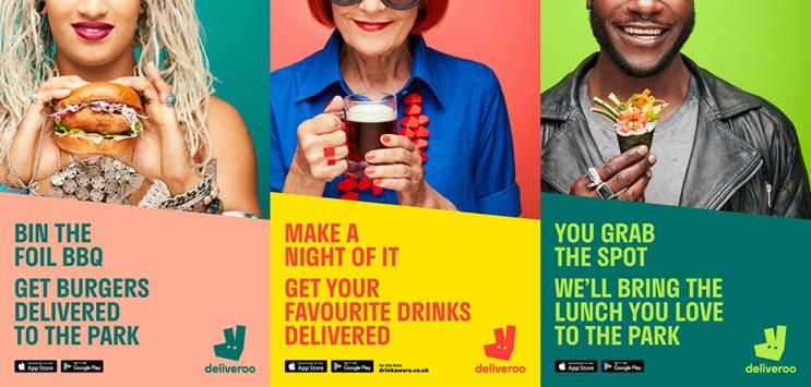
One of my favourite food delivery adverts are from deliveroo as their minimalistic yet eye-catching print adverts are hard to miss around London. By cutting the person's top part of their face helps the viewer focus on the grin each person which brings a positive atmosphere to the advert. There are many vibrant and complimenting colours in the advert which match the brand identity as well as bring a more modern and youthful colour scheme.

Audi produced a series of adverts promote their newest but slightly cheaper range of cars. The break down of the car is intriguing for most people and makes them want to look more closely at the advert. There are several other faster cars inside the outside car, this was done connote the power of the new car. The distinguishing features from each car inside the cars make a great puzzle for car enthusiasts, and this helps the advert target its niche-r audience of car lovers.

Another notable print advert is the Nescafe advert which shows an alarm clock looking like a cup of coffee. This is a relatable sentiment for many people as when they wake up in the morning, they drink a cup of coffee. The focal image is large and surrounded by a gradient background so the focus is all on the focal image. The richer tones of red have subtle connotations of luxury which gives the brand a more prime feel.
I like these adverts as they are straight to the point and with a clear message that can be seen easily. This more colourful and sometimes minimalistic type of advert is more popular in print adverts nowadays as people only skim over the adverts, so the message must be clearly given in the time the viewer sees it. I will be applying this idea to my advert as I want the audience to clearly understand the story and its resolution.
Blog Post 6: Research into Existing TV Commercials (Other Genres)
I did this so I could find out how other food companies connote their brand. This was done by searching through videos on Youtube and compiling a playlist of them, this can be accessed via my Blog Post 5
Here are the two adverts I learnt most from:
M&S; Adventures in Fiesta
Here are the two adverts I learnt most from:
M&S; Adventures in Fiesta
- The way they show the food is said to be called 'Food Porn'
- The advert is extravagant and exciting as there is
- Lots of eye-catching action
- Many bright colours against a black background to help them stand out
- This helps glorify the food and bring about positive connotations towards the brand and the food they produce
- The advert is cut/edited to the beat of the music. This makes the advert very satisfying to watch and in turn quite memorable
McDonald's; Dead Dad Advert
- The advert tells the story of a boy discovering what his dad was like
- Lots of emotive appeal
- Sets up story with a cute kid going through a collection of memorabilia
- Collection of items fit for an older person, so they aren’t his
- Final reveal to all questions: what was dad like?
- Sombre atmosphere created through darker colour grading and slow paced editing
- Desaturated colour scheme and the constant sad look on the kid’s face also emphasise this
- Very English family; shown through location, accent, actors, clothing
- Script is showing how all of the dad’s attributes are juxtaposing all of the kids attributes, and makes the audience feel bad for him
- He lights up when he thinks of something to ask about his dad, then is disappointed that he doesn’t get the answer he wants
- Lots of long and empty shots to connote his loneliness
- A couple close ups to emphasise his sad emotions
- Most shots have a lot of space and area around the child
- Mother kinda ignores the kid’s look on his face
- “1:09 Mother walks off shot for just long enough to capture the feelings of isolation and abandonment before...
- 1:10 ...*THE LOGO REVEAL!* Smiles, happiness, eye contact between the mother and the son, finally
- Note the logo was distinctly absent from the exterior shots just gone
- Colour grading seems to get subtly warmer too. Outside McDonald’s = cold, sad, lonely. Inside McDonald’s = warm, happy, social.”
- 1:16 Oh wow, who knew a Filet-o-Fish® could be so poetic? The moment he opened the packaging the connection to his father he so desperately longed to find was revealed.”
- Very cute and adorable way to finish if belief was suspended
- Positive connections to the product
- If belief not suspended then it’s very funny to see
- The Logo has it’s own 5 seconds at the end for anchorage
- Super clear and minimalistic design
- Minimal text
- Colour scheme associated with the brand
- How they style the burger
- Food shows everything that it has
- Very perfectionist and idealistic
- Made to look extremely appetising
- Shiny, puffed up and is starting to make me hungry
This was very much useful to my final advert as it only confirmed what we previously thought the conventions of TV ads were by watching a wider range of adverts. This also meant I was able to look at a larger variety of ideas to incorporate into my own advert and I used many of these typical ad conventions such as title cards and voice over in my own advert as seen in these other adverts.
Blog Post 5: Research into Existing TV Commercials for Take-Away Food Delivery Services
I researched this because I wanted to find out the conventions of food delivery adverts and what made each advert successful. I did this by making a playlist on YouTube and compiling a range of adverts to look at.
These two adverts had the most impact on my work:
Deliveroo; Eat More Amazing
Hungry House; Space
This was beneficial to my project as it gave me a couple of ideas about what my adverts could be about while also finding out the many conventions that I should follow in my adverts such as an ending title card.
 |
| A screenshot of the Youtube Playlist, You can click here to access the playlist on Youtube |
These two adverts had the most impact on my work:
Deliveroo; Eat More Amazing
- City setting
- Reminds me of the start of a TV show through the use of an establishing shot and long shots
- The unique part of the advert blends into these long shots seamlessly
- It is first subtly shown through the reflection, and then more focus is drawn to it
- Implies the blending of normal mundane life with a fun alternative
- Very Comical and exaggerated
- Shown through (presumably) the POV of a person which allows the viewer to assume that this could be something they could see themselves
- Cinematic like you would see in a TV show or film
- A range of shot types to make it interesting
- Match cut at the end to link the fictional story to the audience member
- Very chill and relaxed music - positive connotations of service
- End Card flicks through many restaurants, then ends up on Deliveroo logo with their slogan
- Use of their blue and white colour palette
- Slow and Chilled paced editing to fit daydream mood
Hungry House; Space
- Establishing shot at beginning of space station
- Introduces a problem connoted by the stomach growl
- Comical and slightly exaggerated acting to help convey the story whilst making it seem like a true possibility - realism
- An easy method is shown - 2 taps on the phone
- Almost instant response
- Positive representation of the service
- Sound design to show heroicness of the delivery
- Comedic stuff to make it fun and enjoyable
- Seemingly ‘Perfect’ and delicious food is shown on screen to highlight the end product
- Idealise service to make it seem more appealing
- Joy and happiness in astronaut’s eyes when eating food
- Logo at the end with a website to anchor the company into the viewer’s mind
- Links adverts to the same marketing campaign
This was beneficial to my project as it gave me a couple of ideas about what my adverts could be about while also finding out the many conventions that I should follow in my adverts such as an ending title card.
Blog Post 4: The Target Audience (Males and Females Aged 16-25)
According to our brief, our adverts had to target Males and Females aged 16-25. Researching into this demographic and finding their interests helped me create some initial ideas that could widely appeal to the audiences.
In 2005, Channel 4 created Crowd DNA in order to study how TV could satisfy every audience's needs. One aspect of the project focused on youth culture and offered a tribal breakdown based on what the people had in common (Music, Fashion, Sport etc.). This became a big part of the project and was soon named 'UK Tribes' with a brief to explore and extend the research of youth culture in an honest and realistic matter. Luckily, this age group was 16-25 matching our brief exactly. Here is what I found out:

In 2005, Channel 4 created Crowd DNA in order to study how TV could satisfy every audience's needs. One aspect of the project focused on youth culture and offered a tribal breakdown based on what the people had in common (Music, Fashion, Sport etc.). This became a big part of the project and was soon named 'UK Tribes' with a brief to explore and extend the research of youth culture in an honest and realistic matter. Luckily, this age group was 16-25 matching our brief exactly. Here is what I found out:

There are 5 main tribes within the community:
- Tribe
- Attributes that make the tribe identifiable
- Thoughts on how that could influence my advert
- Mainstream
- The backbone of society. There are generally seen as the 'cool kids' and have a strong emphasis on conformity
- People such as Chavs, Sports Junkies, Fangirls and Blingers
- Listens to Itunes top 100 and EDM House party music
- Chav looks inspire 'Leading Edge' trends
- Emergency food for parties or certain situations, so a 24/7 service may be of use?
- Leading Edge
- Proactive people
- All about doing, creating, debating, performing etc.
- With the new use of technology, voicing original ideas is much easier
- We're a delivery service, so we need a lot of varied restaurants to accommodate all types of people, especially picky/fancy ones
- Uniqueness to brand to make it more appealing?
- Urban
- Urban Tribes are strongly influenced by what they see and experience in their immediate environment
- Urbans are best known for music – from R'n'B, grime, UK bass and funky to old school jungle and rap
- Fashion-wise, streetwear rules – from classic sports brands to independent urban labels, such as Adidas. Drawing inspiration from US street fashion, these Tribes were among the first to adopt the baseball jacket and snapback combo – a look now adopted by Leading Edge Tribes aplenty.
- Lots of being independent and leading their own way in life, driven by what they enjoy, whether that be fashion, money or just relaxing
- Customizability
- Reliability
- Accessibility
- Aspirant
- Very modern teenage look, hoodies, jeans and headphones
- Trendies, vloggers, hipsters, Hypebeasts (wearing said brand)
- Love of music, festivals, fashion and football
- Slight boost with help from the internet; Youtube and Instagram playing a heavy role
- Alt
- Known as the Internet culture
- Gamers, Superfans, Alternative music lovers, geeks
- A massive tribe, becoming increasingly bigger
- Love using technology and the internet so that accessibility will be crucial
- Overall;
- Upbeat music is generally the most appealing to a wide variety of audiences
- Each group is looking for their own uniqueness of how to represent themselves to everyone else
- Lots of influence from the internet and technology
- This is still a general overview, a singular person will have their own hobbies and things they like
- Lots of focus on community and bringing people together
Blog Post 3: The ASA BCAP Code
 |
The main principles from the ASA I noted were that:
- The advert cannot cause distress or contain anything that is likely to cause physical or mental harm
- No loud or obnoxious sounds can be used
- Cannot encourage child obesity
- We are a food delivery service so I cannot imply any unhealthy habits
- Obvious exaggerations ("puffery") and claims that the average consumer who sees the advertisement is unlikely to take literally are allowed provided they do not materially mislead
- Must a very obvious exaggeration that the viewer could recognize
- Subjective claims must not mislead the audience; advertisements must not imply that expressions of opinion are objective claims
- Can't say promises without proof
- Advertisements that include a comparison with an identifiable competitor must not mislead, or be likely to mislead, consumers about either the advertised product or service or the competing product or service.
- There is a thin border when talking about competitors
 |
| The 3 chapters that were most relevant to my adverts. These can be found at https://www.asa.org.uk/codes-and-rulings/advertising-codes/broadcast-code.html |
This research helped my project as it helped me rule out ideas that were inappropriate and broke the ASA codes. I was also able to read the code in greater detail than I already knew, for example, I cannot feature any video games that have certain age restrictions and I cannot involve alcohol in my advert, both aspects that impacted an advert.
Blog Post 2: Channel 4
Researching Channel 4 was a key part of my research as their company mottos and values are vital to understand in order for my advert to fit in the Channel and best use their outreach. Channel 4's website, their annual report and Wikipedia articles gave lots of information about scheduling, the TV shows that they air and other useful information.
 Channel 4's annual report demonstrated its growing ambition to support diversity throughout all the content aired, not only black, asain and minority ethnic (BAME) groups, but also a rising change in the perspective of the LGBT community.


 |
| A comparison of Channel 4 to other popular channels in the UK |
Channel 4 is a public service television broadcaster launched in 1982 as a 4th accompanying channel to BBC1, BBC2 and ITV. With 11 sister channels and 5.28% of all audience share, Channel 4 is an ever-growing broadcaster striving to reach more people than ever.
Channel 4 has a list of aims to achieve each year, as part of the public statutory remit. It consists of 15 elements including:
- Encouraging innovation and experimentation
- Provide educational content
- Reflecting the cultural diversity in the UK
- Inspiring change in people's lives
- Supporting Young People


With the rising popularity of on-demand TV, Channel 4 introduced All4, a way for the viewers to watch most programmes that have aired recently, whenever they wish to watch it. This proved to be a huge success; for example, "The End of the F**** World's full boxset was released on All4, 3.1 Million users watched the series within 100 days of the programme launching. 69% of these finished the whole series on the same day.

The Great British Bake off proved to be one of the most-watched programmes this year for Channel 4, receiving an overall audience share of 54.5% of 16 to 34 year olds. Other shows that this age demographic enjoy are Gogglebox, The Simpsons and Hollyoaks; these shows all air in the evening, from 6pm onwards. The Simpsons airs almost every day at 6pm, Gogglebox airs around 9pm and The Great British Bake Off airs from 8pm; I will place my adverts before, during and after each of these shows.
Overall this research taught me about the values of Channel 4, and how I should use them to help reach more of Channel 4's audience. Shows such as Bake off and Gogglebox have a demographic that suits the 16-25 age range we need to aim so I can put my advert around these shows to maximise my reach.
Blog Post 1: Existing Take-Away Food Delivery Services/ Industry
I researched food takeaway services in order to find the conventions of the services, and understand the industry. I did this by researching the different brands and looking at what made each company unique from the rest. Some companies that I researched into include: Deliveroo, Just Eat, One Delivery, Hungry House and Uber Eats. They can be separated into two different types of delivery service, aggregators, and new delivery. Aggregators work as middle-men, taking orders from customers and giving them to restaurants. The delivery, in this case, is the responsibility of a chosen restaurant. On the contrary, new-delivery services make the same thing, but they take full responsibility for the delivery process, building their own logistics for the best delivery. This is especially useful for those restaurants that don’t have their own drivers. This type of delivery service is becoming much more popular nowadays as it allows the customer to chose from a larger variety of restaurants giving them more choice on what food they want to eat.
A specific look at Just Eat and Deliveroo:
 Just Eat is one of the leading companies in this industry, serving over 22.8 million customers around the world. One of their mission is to create the world's greatest food community, and they are already serving over 100 different types of cuisine from 87,000 restaurant partners internationally. Another aim for the company is to make food delivery an exciting experience for both the restaurant business as well as the customer. The use of their app is a great appeal for the younger generation (the main demographic) as phones are greatly intertwined into their lives and this convenience helps to create a stress-free experience. For the customer, Just Eat boasts a significant message throughout its work; choice. However, around the time of which we were doing research, there were many articles about Just Eat in the news as hygiene ratings in their app had been quite hidden and not very easy to obtain. It turns out they had many restaurants on their app that had a 0 hygiene rating which should have meant that they were shut down but Just Eat continued to provide service for them. This problem was mainly due to Just Eat's sign up system that lacked background checks on the restaurants. This allowed for some restaurants to provide food for Just Eat's customers when the restaurant should have closed down.

After being founded 12 years after Just Eat, Deliveroo is a growing competitor in the marketplace, having revenue growth of over 650% year after year. Deliveroo's aim differs from Just Eat's; Deliveroo desires to bring great food direct to customers as fast as possible, in less than 30 minutes. Restaurants who partner with them see their revenue increase by up to 30%, creating thousands of jobs in the restaurant sector. The secret behind Deliveroo's system that helps them compete with bigger companies is their ‘Frank’ algorithm. It is a predictive technology and evaluates the most efficient way of distributing orders based on the location of restaurants, riders and customers.
App and website design:
This research was extremely useful to my initial plans as they gave me ideas on what my adverts could focus on. Great food and the speed of the delivery seemed to be a very high priority for the other companies as these are the aspects of the service that reflects the company the most. The companies never talk about the prices of the food because as a delivery service, we do not have much control over the base price so this will be reflected in my advert.
A specific look at Just Eat and Deliveroo:
Just Eat is one of the leading companies in this industry, serving over 22.8 million customers around the world. One of their mission is to create the world's greatest food community, and they are already serving over 100 different types of cuisine from 87,000 restaurant partners internationally. Another aim for the company is to make food delivery an exciting experience for both the restaurant business as well as the customer. The use of their app is a great appeal for the younger generation (the main demographic) as phones are greatly intertwined into their lives and this convenience helps to create a stress-free experience. For the customer, Just Eat boasts a significant message throughout its work; choice. However, around the time of which we were doing research, there were many articles about Just Eat in the news as hygiene ratings in their app had been quite hidden and not very easy to obtain. It turns out they had many restaurants on their app that had a 0 hygiene rating which should have meant that they were shut down but Just Eat continued to provide service for them. This problem was mainly due to Just Eat's sign up system that lacked background checks on the restaurants. This allowed for some restaurants to provide food for Just Eat's customers when the restaurant should have closed down. |
| Deliveroo's app screenshots as seen on the Google Play Store |
After being founded 12 years after Just Eat, Deliveroo is a growing competitor in the marketplace, having revenue growth of over 650% year after year. Deliveroo's aim differs from Just Eat's; Deliveroo desires to bring great food direct to customers as fast as possible, in less than 30 minutes. Restaurants who partner with them see their revenue increase by up to 30%, creating thousands of jobs in the restaurant sector. The secret behind Deliveroo's system that helps them compete with bigger companies is their ‘Frank’ algorithm. It is a predictive technology and evaluates the most efficient way of distributing orders based on the location of restaurants, riders and customers.
App and website design:
- Design of the app
- Minimalistic design, modern and attractive
- Spacious
- Bright and colourful to help connote the exciting experience
- A clear colour scheme to match the brand
- Higher end phone in all the shots, however, no phone brand is ever shown
- Actual app services:
- 3 Steps:
- Choose Food and Restaurant(s)
- Where to Deliver to
- How to Pay
- Other additional tabs include
- Offers Page
- Recommended
- Search for nearby restaurants
- Types of food tab and ratings tab
- Data and Cookies used to help the user find food that they may like
This research was extremely useful to my initial plans as they gave me ideas on what my adverts could focus on. Great food and the speed of the delivery seemed to be a very high priority for the other companies as these are the aspects of the service that reflects the company the most. The companies never talk about the prices of the food because as a delivery service, we do not have much control over the base price so this will be reflected in my advert.
Tuesday, October 9, 2018
Continuity Task 2 Evaluation
1. What was your role in the task and what did you actually do?
I helped film the scene, act in the scene in some shots and i also did some of the editing.
2. As a group, what factors did you take into account when planning(a), filming(b) and editing(c)?
a)When planning, we created a storyboard that helped illustrate our ideas to the others. We planned our scene whilst in the setting we were filming in, so we were able to plan our shots accordingly, finding out which shots were best suited for the environment. Since we had a very tight time constraint, the script was made up very quickly, but was given a couple small fixes as we were filming
b)When filming, our idea was to film the main part of the scene from 3 angles, a master shot and the 2 OTS shots, as well as film the extra shots such as the introductory shot and shots including the extra student who comes and asks the 2 main characters a question.
c)Having filmed our scene from the 3 main angles, we had a lot of flexibility with editing as we had plenty of footage. Because of this, we were able to make the scene flow as smoothly as possible and have very tight edits.
3. How successful was your sequence? Did you fulfill the demands of the brief? Did you manage to demonstrate match-on-action, shot-reverse-shot, and 180-degree rule? Did you achieve continuity overall?(WWW/EBI)
I am very happy with the final sequence and I believe that we fulfilled the demands of the brief. We were able to successfully demonstrate the match-on-action in the beginning few shots, the shot-reverse-shot during the main conversation all whilst keeping within the 180 degree rule. Overall, we nearly achieved continuity; however, between shots 4 and 5, Kush (the actor on the left) turns his body from facing the table to facing Cathy (the actor on the right) and this jump disrupts the continuity of the sequence.
4. What have you learnt from completing this task? How might this learning impact on future video production work?
I have learnt to be attentive to all details within a sequence such as body language and even eye contact. This will help me in my future coursework as the extra attention to detail will give the whole sequence a much more professional look.
Monday, October 8, 2018
Bolt UK Disney Trailer Analysis
Bolt is a 2008 Disney film about a canine superstar named 'Bolt', a star of his own action adventure TV show. His days are filled with danger and intrigue, until one day, when he becomes lost and travels outside the set o the TV show. But Bolt doesn't know that he's on a TV show; he thinks his amazing powers are real. When Bolt is accidentally shipped from his Hollywood soundstage to the mean streets of New York, he begins his adventure: Armed only with his delusions and accompanied by a cat and a hamster, he sets out to to find his way home, and find his owner, Penny.
The trailer starts with the disney inter-title. This sets the audience expectation very high as Disney have a reputation to produce very well known and successful films such as The Incredibles and Snow White and the seven dwarves. The following shots help set-up the premise of the story. Things such as the transitions, a TV flicker between cuts, and the background narration help set up the premise of the core story. The non-diegetic sounds such as the music help increase the 'epic' nature of Bolt's actions, and this is a part of Disney's 4-part marketing plan. Kids are one of the main audiences for Disney, and these superhero-like actions help the film appeal to this audience. The next shots also show the 'behind the scenes' part of Bolt's TV show. This helps set up the story as well as appeal to the tech-savy side of Disney's audience.
The disruption is talked about in the narration, but is aldo clearly denoted in the shots soon after when Bolt sprints out of an office, his face panic stricken. The background voice also has a lot of panic and worry in it. This unease helps emphasise the crux of Bolt's problem helping to push the story forward. Furthermore this problem may be relatable for some audience members, so they may be more able to relate to the problem, therefore adding appeal for them. These shots are followed by the introduction of another character, the cat, and a comedic moment between them. The cat is an excellent representation of the opposites to Bolt, portrayed through physical being as well as through character and some hobbies(later discovered in the movie). The camera angles in this scene also help emphasise Bolts vulnerability, a low angle for the cat's shots to show her dominance, and high angle shots on Bolt, to connote the fact that the cat is looking down on him, in a sort of patronising manner. Bolt is also portrayed as a helpless kid in these shots forward which heavily contrast the more in control Bolt seen previously, and this helps excentuate one of Bolt's problems that contributes in the story.
The hamster seen in the beginning of the trailer is seen once again soon after the previous shots, and links the starting shots to the significance of the story.
Wednesday, September 26, 2018
Reflections on Practical: TV Drama Stills

------------
Our groups's plan for each of our shots, the first row being mine
------------

------------
The final shot
------------
Provide a brief summary of how you planned out your photography practical:
In planning for the photography practical, our main hopes were to get a photo that had a lot of mystery and enigma to it; and so the genre of thriller was chosen, as it provided a lot of flexibility to our shots. Initially, my still intended to consist of a close up hooded figure in the dark, surrounded by guns pointing to their head. I would have done this but taking multiple shots of the gun in different positions, then edit the photos to superimpose the guns onto one photo to make it look like there were multiple guns, but due to our time limit, we did not have time to take all these photos so instead, we chose a machete to use instead. The shot would look weird if there was just a flying machete, so we added another character in the background, and with some nice lighting, the shot was complete.
Analyse your chosen shot and identify in what ways it could be described as signifying your chosen TV Drama genre/subgenre:
My chosen genre was thriller, and one of he ways i conveyed this was through the use of colours and lighting. The still has a very dark background and colour scheme. This brings a lot of enigma to the scene as not much is known, and this is a convention of the thriller genre. The dark background also helps the main focal images stand out, and matched with the harsh lighting on the side of the actors' face, leaves one side of their face dark. This is to partially show the audience the emotion of the characters, the character at the back having a very cold look in their eyes, whilst the other character is just seen looking down almost as if he is accepting or unaware of what is about to happen.
How did you intend the audience to interpret your still? What narrative moment were you attempting to create? What meanings were you attempting to communicate?
I wanted my audience to see the actions of the characters and think about what will happen next. This is connoted to be that the character in the front may be killed, as he has a knife to his through with some blood already visible. I also kept a lot of mystery in my shot as the purpose of thriller movies is to keep the audience on the edge of their seat wondering what will happen next. In this case, the mystery is in the 'why is he about to die?' rather than 'how is he about to die?'.
Identify what is successful about your shot:
The lightning is what makes this shot work in my opinion. It helps hide the character's face whilst also showing some of their faces to reveal some emotion, and the lightning also just about shows the blood on the machete, connoting the events about to occur. The mise-en-scene also helps the audience identify the genre which is key for this still.
What would you do differently if you were to repeat this activity?
I would have spent more time planning if we had the time, but overall i am very happy with my still.
Sunday, September 23, 2018
Continuity Task 1 Evaluation
The in cut camera clip:
1. Explain the story of your video
A student is doing their homework. Another student realises that he may be late to class and makes his way to his class. On the way, he notices the first student, and reminds him of the time. This student panics, shoves everything into his bag and starts to run to class. But as he starts to run, he trips over a curb and hurts himself.
2. How did you attempt to create 'Narrative Flow' (continuity)?
- The same costumes were used throughout
- The main story was kept as clear as possible and linear in chronological order
3. Did you achieve full continuity? If not, why not?
I believe we did as the main key elements of the story were conveyed. However, we could've done a few things to help the audience understand the full scenario and scene as explained in the next question.
4. In hindsight, what would you do differently to improve the narrative flow of your video and tell your story more effectively?
In order of shots:
- Wider shot as the framing makes everything feel a bit cluttered and busy.
- No sense of placement in relation to first shot. If it were a cross cut, we would need more shots. Shot is too long. If this student is late to class, he would be running not walking.
- Too much empty space on right hand side as there is no reason for it.
- 30 degree rule broken, jump cut feel.
- Continuity error with objects on table.
- Tighter cuts needed to portray action feel.
Here is a slightly edited version of the clip too:
Thursday, September 20, 2018
My TV Still Analysis - Death In Paradise

Subscribe to:
Posts (Atom)